a beginner’s guide to cooking
by Blake Lassiter, Harold McLamb, and Carter Pape
abstract
One challenge of cooking for beginners is time management. Preparing multiple recipes at once is also challenging because multiple threads of focus must be maintained. We seek to solve these related problems with a novel interface for kitchen assistance.
Queuing recipe steps such that time spent in the kitchen is optimized requires a nontrivial amount of thought by the user. Our application externalizes the cognitive loads of time management and multitasking while cooking, allowing the user to better focus on the task at hand.
A main feature of our application is that it alerts users when to start cooking each item of their meal, which allows the recipes to be prepared in a more efficient manner so that the recipes are all completed at once and items don’t get cold before it’s time to eat. The app provides recipes from which the user can search and browse. We keep data in the app about each recipe and time spent on all of the steps to allow the app to optimize timing for any given combination of recipes so that the user doesn’t have to.
design process
In this section, we will cover how we went about our design process, and what we discovered each step of the way. We will explain our discovery techniques and how we used scenario-based design to begin our planning. We will then cover our mockup stage and the various techniques we used in our iterative design process, as well as ideation techniques used. We will also cover the thinking behind important design decisions made at this stage. Next we will cover how the implementation differed from the design, what we learned about our design in the process of implementing it, and how users reacted to our final product. In each section, we will also highlight how we made users involved during that step of the process.
discovery
To begin our design process, we implemented a scenario-based design approach. We started by proposing, to a small group of potential users, a scenario illustrating a root concept of the target domain (keeping track of progress on multiple recipes). The scenario was:
Joe is making a dinner that involves a main dish (chicken) and lots of side dishes (green beans, other vegetables, …). He wants to use the app to keep track of the multiple timelines that are going on at once to externalize the mental load of tracking what’s going on in the kitchen.
We then had the participants put forward questions to the scenario, and each question was answered with another scenario. Once we had addressed a part of the target domain adequately, we moved on to another part. Some of the questions that we ended up answering included:
- How would you like to find the recipes you use with the app?
- How important is correct timing to the success of a recipe?
- How should a recipe involving techniques that a beginner may not know (sautéing or poaching, for example) be treated?
- How should mistakes during recipe preparation be handled?
After answering these questions with scenarios, we started getting a better idea of what functionalities our app should have, and had some ideas for how to start designing an app that would do all of the things the discovery group wanted to see it do. We also defined the following terms: a meal is a collection of recipes, and each recipe contains steps, i.e. directions, to prepare the recipe. As we will see later, during preparation of a meal, many recipes (because they have different steps) can be at different steps at the same time since they are being prepared simultaneously.
mockup
To begin our mockup stage, our group consolidated a list of concrete functionalities that we wanted our app to have, and once we listed enough of the functionalities, began putting them into logical groups. After our first iteration of this, we ended up with about seventeen core functions listed. After grouping them and finding holes in the basic functions we’d need, we ended with twenty-four functionalities broken into six groups. After organizing the app’s capabilities into groups, we assigned titles to each group and created a design flow for the application.
We ended up with four groups we knew would require at least partially novel designs: a meal preparation view, a recipe list view, a recipe details view, and a meal “checkout” view. We did our first mockups on whiteboards, making iterative changes as we settled on a design, and then made final edits once we transferred the designs into digital mockup software (Fluid UI).
Next we will cover the details of what drove our design choices for each of our four main views.
meal preparation view
The purpose of this view is to guide users through preparation of the recipes they have added to their meal. The application is aware of progress through each recipe, and how much time is left on each. This guides the user’s focus between recipes and steps such that the multiple recipes in the meal are completed as close together as possible. Immediately, we see the need for the design to satisfy particular needs: focus the user on the current step, provide users proper context as the app shifts their attention between recipes, and keep track of time for steps that involve waiting.
Our first inspiration for this design came from the design of navigation systems (like Google Maps) on phones. The goal of their design (leading users through a set of steps, i.e. directions) is similar to one of our goals. We will take Google Maps for the iPhone as our representative example; while a user is navigating, most of the phone’s screen space is dedicated to indicating the current step in navigation. This indicated to us that our design should also emphasize the current step in a similar fashion.
While the Maps app must give a very succinct description of each step to minimize the focus it takes from the user while driving, our app could afford to ask for more of the user’s focus. With that ability, we decided it may be beneficial to provide more in-depth context to the user while cooking that may help at each step (for example, providing videos for how to complete certain complicated cooking tasks, such as poaching). This addresses our scenario in which a beginner user is poaching an egg, but doesn’t know how, so the app provides an explanatory video.
We also wanted our app to walk users through multiple threads of steps (i.e. recipes) at once. This required a design that allows users to see the current step of multiple recipes. We decided that attempting to visualize the current step of each recipe on screen at once would crowd the screen and unnecessarily break up the user’s attention, so we designed a solution that keeps only one recipe on the screen at once, but provides an affordance for accessing the other recipes, specifically by swiping the screen. This design decision was inspired by the swiping action on the iPhone home screen, which affords access to multiple pages of apps while only displaying one page at once.
With these thoughts in mind, we settled on a simple design integrating these two ideas. See the figure to the right for the Fluid UI mockup of the meal preparation view; note the timer in the middle (only visible for steps that involve waiting), the smaller previews of the previous and next steps, and the page view dots at the bottom of the view indicating that other recipes can be accessed by swiping.
recipe list
The recipe list serves the function of showing featured recipes that users can browse for meal ideas, as well as providing a search functionality to allow users to find a specific meal they are looking for. Taking a page out of the book of allrecipes.com, we also decided it would be good to allow users to browse not just featured recipes, but also browse recipes sorted by category (for example, dinner, dessert, lunch, breakfast, …).
To begin our design, we looked at the iPhone App Store (see right), which also serves the function of displaying to users featured items sorted into categories. The feature that most struck us was the horizontally scrollable lists. We found it a challenge to think of ways to indicate in a minimalistic, attractive manner that a certain part of the view was scrollable, but the app store does a good job of indicating that the list of apps in (for example) the “10 Best Apps of the Year” section is horizontally scrollable by making the rightmost app partially off-screen, indicating to the user that they may scroll to see the rest of the app icon, and that more are likely to be right of it as well.
To provide a way of searching, we used an industry standard of having the search bar at the top of the view, starting out hidden at first, but viewable if the user scrolls up. This design is implemented in the iPhone Mail app, as well as the iPhone Spotify app. We recognize this obscures visibility of the search functionality, but decided that the tradeoff of making the feature visible in exchange for a cleaner view (the search bar adds two additional elements to the screen: the text box and the cancel button) was a worthwhile tradeoff.
recipe viewing
There are already designs available for displaying information about an item that has a rating attached to it as well as other information, but we were inspired by the iPhone App Store in particular. In the App Store, while viewing a specific application, a segmented control is visible that allows users to switch between seeing details of the app, reviews of the app, and related apps. In our recipe view, we wanted to allow users to switch between viewing the details of the recipe and viewing any note that they had written about the recipe, so we used this same segmented control design. This prevents the view from getting crowded with many controls and labels simultaneously; we instead hide some information while displaying other information, but also provide an easy method to switch the currently viewed information. By toggling between the two views in a very recognizable way, the user can extend their knowledge of the recipe while maintaining a relative position on screen.
Another main feature of the recipe view is the aforementioned ability to view the user’s note about a given recipe. This note can allow users to remind themselves about any modifications they may have made to the original recipe, or other notes that are useful to have handy about the recipe. This feature was inspired by a scenario of which we thought that involved a user who had accidentally used margarine in the place of butter in a recipe wanting to remind himself to do the same thing next time they prepared the recipe.
meal view
The meal view is what you see right before starting to cook a meal. It provides a list of all the needed ingredients for all of the recipes, gives you the ability to modify the quantity of recipes in case you want to make more of something, lets you see all of the equipment and skills that will be needed, and provides an estimation of how long it will take for the whole meal to be ready. A button is provided to start the meal, and the user is given the opportunity to edit the list of recipes (i.e. remove recipes if wanted). We decided a simple chained list view would suffice for this part; we put the recipes at the top (the most pertinent information to the viewer), followed by the ingredients list (absent from the mockup, but part of the plan anyway, in case the user wants to check that they have all the ingredients), equipment list (in case the user needs to buy additional equipment, or improvise), and skills list (to let the user know what particularly difficult tasks lay ahead). This idea was inspired in part by the industry standard shopping cart, as it is a familiar design to the user and gives all the functionality that we need.
implementation
During the process of implementing our mobile application, we adjusted some major aspects of our original design to accommodate time constraints and our lack of Android development knowledge. One feature that was proposed but not implemented was the ability for a user to view the list of steps for each recipe they were cooking by swiping the screen horizontally (see “prepare a meal” for details). This feature would have provided better context to the user while cooking, specifically allowing users to see which to which recipe the current, previous, and next steps pertain. This would have also allowed for manual navigation by the user between recipes and their steps.
Because of aforementioned limitations, we instead implemented the recipe steps view by compiling all steps of all recipes into one list (selecting by hand the order of steps such that all recipes are completed around the same time, as the app would have been programmed to do). Benefits of this design include that 1) the user is not overwhelmed with all steps being displayed on screen at once, as they would have with a simpler list view, and 2) the design provides an affordance to the user for tracking their progress in the list of steps. Providing one list view instead of multiple (as in the planned design) also provides greater focus by showing the user only one “current step” for the whole meal rather than one “current step” for each recipe, as in the planned design.
next steps
We will now list some of the minor design choices we made that did not make it into the final design:
- Alerts and notifications on the timers
- Pause button for the timers
- A larger list of recipes, and the ability to browse and see featured recipes
- Adding search functionality for recipes
- Providing the user a dictionary of skills and videos related to those skills
- Ability to write notes about recipes
- An “edit” mode in the meal view to allow for easier removal of recipes
- Ability to edit the quantity of recipes
- Segmented control in the recipe view for viewing details or notes of recipes
product
Here, we will discuss the final product, covering the details of final functionality.
navigation bar
A back button and a “more options” button (on the right of the bar) is present in all views; the navigation button reveals options to take the user to the home screen (the recipe list view) or the meal screen (where they can review the recipes they have added and check on the ingredients, equipment, and skills required for preparing the meal). The exception to the navigation bar being visible at the top is when the user has entered the cooking phase, when the navigation button instead reveals the option to cancel the cooking process and return to the home screen. When this happens, all items are removed from the meal.
recipe list
When the application loads, the user is presented with a view of all recipes where individual recipes can be selected. The page is scrollable if the list of recipes extends past what is visible on screen. The list of recipes is sorted alphabetically, as that is the most logical approach to categorizing a list of unfiltered data for a user to search through. In our implementation, we have made available three recipes for users to select in a demo.
recipe details view
When a user selects a recipe, they are presented with a detail page. Each recipe has a title, image, description, time to complete, rating bar, ingredient list, equipment list, and skills list. A rating can be assigned to the recipe by allowing the user to select between one and five stars. A button that allows the user to add the recipe to their meal sticks to the bottom of the screen at all times. If the user clicks it, the meal page is shown, where they can see that the recipe has been added to the list.
meal view
This is where the user can review the meal that they are putting together. It can be accessed via the menu in the top right or by adding a recipe to the meal. From this page, the user can review how many of each meal they have in the checkout, what ingredients they need to prepare the meal, what equipment they will need, and what skills they will need to complete the meal.
prepare a meal
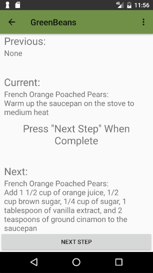
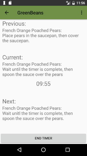
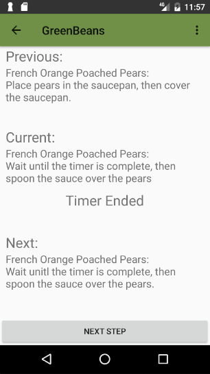
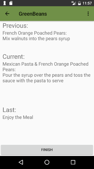
Once a user selects to start a meal, they are directed to the meal preparation screen. A button is presented that lets them see the first step. The button label then changes to “NEXT STEP”. If a step requires timing, arriving at that step initiates the timer, and an audible and visual alert is presented to the user once the timer runs out. While the timer is running, the button at the bottom of the screen changes to “END TIMER” in case the user elects to interrupt the timer. When the timer is not visible, in its place, the text “Press ‘Next Step’ When Complete” is displayed. After a step is complete, the user is expected to tap the “NEXT STEP” button to view the next step. Since the first step has no prior steps, the previous step is replaced with “None”. At the end of preparation of each meal, the preview space for the next step is replaced with “Last step: Enjoy the Meal”.
To conclude a meal, the user taps the “FINISH” button, which will direct them back to the home screen with an empty meal list.
evaluation
After completing our final implementation, we allowed a group of 3 people to try out our application for final remarks. It is very helpful to obtain information after eliminating most bugs from an application and allow for a fully functional demonstration.
One of the first things that the users noticed was that it was not totally obvious that the recipe view page had more content than what is first loaded because it is not obvious to scroll. One tradeoff that was discussed earlier was to leave the scrollbar visible at all times, like a browser bar. However, we maintained the convention that mobile applications have adopted, which is to only show it when the page is loaded, or the page is being scrolled. The users later discussed that perhaps the fact that the application was run on an emulator caused the struggle. Most users are very aware that mobile applications scroll, and it is determined by just a slight touch to the screen and the apparent motion that occurs.
user testing
- During user testing, we found that the user wanted to be able to look at the status of each individual recipe
-
For steps that are repeated, the user wanted a feature that keeps the same step in the view, but with a counter of how many times to do it
-
An advantage of this is that the screen does not fill with identical content, which could lead to the user believing that the app froze
- Users wanted to be able to see how far they are into the recipe and how much time and steps they have left
user feedback
After running through a demo of the app with users, we then had them share some of their thoughts about features that could be changed or added, or features that worked particularly well.
- Want a pause button for the timer
-
If you accidentally cancel the timer, you can’t do anything about it
-
We knew this and the pause button would be a problem and is a major flaw in our app. We could not solve this problem due to constraints.
-
Want to be able to go back to the previous step
-
After looking into the app, we think that this comes mostly from the previous problems. If it is harder for users to accidentally go to the next step, this would be less of an issue. However, it is still something that we would like to implement if we had more time. This feature would allow someone to mess up and still go back without having to restart the recipe.
- Really like the ability to view the previous step while cooking
-
Want a list of cooking terms and definitions
-
This is again something we wanted to implement but did not have time for
- Want a list of profiled equipment
- Would like the name of each menu at the top to tell where they are (instead of GreenBeans)
- Would like a way to sort the recipes (e.g. burgers, salads, appetizers like in our original design)
-
Would like a way to review and rate items after a meal so they did not have to remember and go back and find them
-
This is another feature that we never thought of when initially creating the app. Currently, the only way to review an item is by finding it again in the recipe list. This is very time consuming for the user and requires them to remember what they cooked. If they had a history or a review page with all the recipes they just cooked, they could easily click on them and leave reviews for future reference.
-
Want a way to access favorite recipes
-
This would simply be a list of recipes that the user favorited and would all be stored together in a category
- You could take too long in a step that is not timed and ruin the meal
- Can’t I determine which steps to do in order by myself?